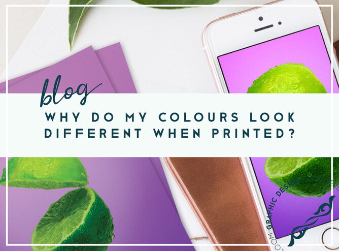
Colours are an important aspect of design, but not all colours are the same.
There are different types of colours; RGB, CMYK and PMS.

RGB ~ Red | Green | Blue
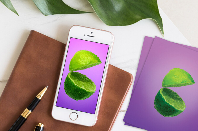
RGB stands for Red Green Blue, used for digital media, such as your monitor, mobile phone and digital camera. They can be stunningly bright and vibrant, even neon if you like!
With RGB, the starting point is 'light'. The more light that is added, the more colour that can be seen. Without any light, there is no noticeable colour, resulting in black. The easiest example is your mobile phone. If it doesn't produce any light, all you see is black. The more light your phone produces, the brighter the colours will be, and if the phone produces Red, Green and Blue at their maximum levels and they are mixed together, you'll see white.
Unfortunately, RGB colours cannot be printed, since paper doesn't produce any light. Paper absorbs and reflects light that is emitted by another light source such as the sun or your desk lamp.

CMYK ~ Cyan | Magenta | Yellow | Key (Black)
CMYK colours are made of four base colours: Cyan, Magenta, Yellow and Key (Black).
Just like RGB, colours are formed by combining these four base colours, except the surface/background with CMYK is white (e.g. the paper). Paper absorbs and reflects light, this means that the colour of the paper itself is also a very important factor in the way the colour looks. CMYK colours don't just absorb the light that is reflected by the paper, but they are also influenced by the colour of the paper. An identical picture printed on white paper will look different than one printed on recycled or lightly tinted paper.
You cannot create that many different colours with CMYK. This mean that colours that you can see on your screen cannot be printed. These differences in colour mainly affect brown, green and purple shades, and most of all very bright colours.
It is very important that files are created with the correct colour coding. If your designs are created in RGB they will be converted to the closest CMYK colour when printed, which can cause unpleasant surprises.
Most products like posters, flyers, banners, and business cards are printed in CMYK, also known as 4-colour / full-colour print. For promotional products (e.g. pens, sunglasses, etc.) and textile items (e.g. t-shirts, sweaters, etc.) usually CMYK is not used. Instead, PMS colours are used.

PMS ~ Pantone Matching System
PMS stands for Pantone Matching System and consists of 18 base colours that can be combined to 1.124 mix colours. PMS colours are a globally used standard. This allows everyone to guarantee the match between the desired colour and the ink colour, which can differ if you don't use PMS colour.
Note: The colour of the ink that represents a PMS colour is always the same. However, this does not mean that the colours will look the same on each product. The underlying material can absorb the ink in different ways, resulting in a colour difference.
PMS colours can also be used for products other than promotional items and textiles. For example, PMS colour are also used for printing spot colour. These are generally very important colour that must always be as identical as possible everywhere (e.g. the red tint of the Coca-Cola logo). This can only be achieved by using PMS colours.
It is difficult to achieve a specific colour and keep it consistent in every print job when using CMYK. During the production process CMYK colour are printed onto the material one by one, in layers. PMS colour are mixed into the desired colour prior to the production process - a bit like when you're having a specific paint colour mixed for your DIY project.

Graphic Design for Print – my first area of expertise
It all started with graphic design for print; way back in 2002 when I was employed to design printed newsletters, annual reports and real estate adverts. I learned a lot about the printing process;
- How on-screen colour can vary drastically when printed
- How colour limitations can affect the design
- How you can only guarantee a colour outcome if you pay for costly Pantone inks (and even then you aren't guaranteed a 100% colour match or consistency)
- How newspapers can destroy a beautiful piece of art!
How you benefit from my experience
It is from these years of experience and learning in an office environment (both from amazing co-workers and also companies able to pay for reprints after my mistakes!) that you can trust me with your print requirements today. There are so many factors that need to be considered when creating design for print, and I will manage all these processes for you, and explain along the way when necessary.
Get in touch, I look forward to hearing from you!

*As writing isn't my area of expertise, this blog was written with the wording references from; www.printsimple.eu