
Seeing, feeling, doing...
Colour is what gets your audience to see what you want them to see, feel what you want them to feel, and to do what you want them to do.
You might notice that technology or finance companies use blues and cooler tones in their branding, or that health food brands often use greens and earthy browns. This is in part thanks to colour theory and the effect that these colours have on us.
We don't all react the same way to colours, as we all have previous experiences with colours from significant events, cultures, people, and memories. However, there are a few generalities about how people respond to colour, and that's what we're going to look at...
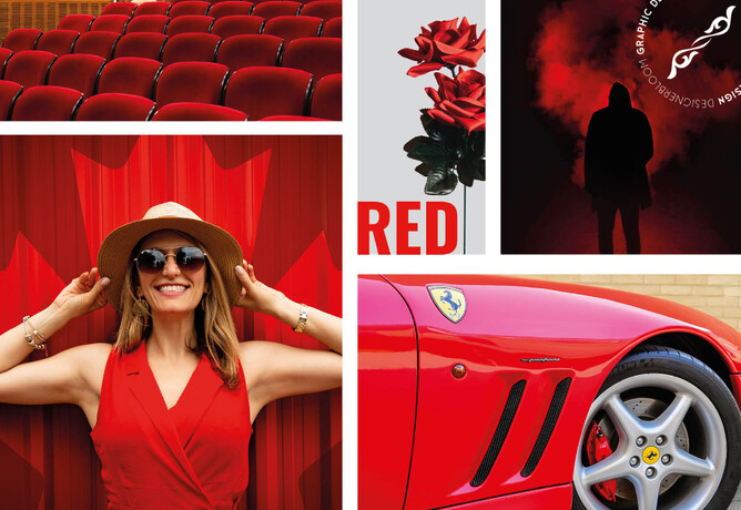
Red
Red is a very powerful, dynamic colour that reflects our physical needs whether to show affection and love, or to portray terror, fear, and survival. Red is also a very energising colour that can portray friendliness and strength, but can also be demanding and show aggression depending on its context. Overall, if you're looking to have a really powerful presence or get someone's attention fast, red is your go-to colour. Just remember to use it sparingly to avoid the extreme negative reactions it can so easily awaken.
Red is commonly seen: Stop lights, Valentine's Day, and horror films.
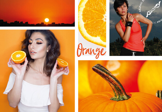
Orange
Orange has a very interesting psychological meaning as it combines red's power and energy with yellow's friendliness and fun. The mix makes orange a good representation of physical comfort in our warmth, food, and shelter. (It even stimulates our appetite so watch out if you're hungry!) Orange is also known to be a colour of motivation, lends a positive attitude, and general enthusiasm for life. Overall, orange is great for bringing comfort in tough times, and creating a sense of fun or freedom in your visuals.
Orange is commonly seen: Fruits, sporting events, and board games.
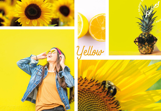
Yellow
Yellow is the epitome of joy, happiness, cheerfulness, optimism – you name it. Anything happy is almost always yellow. The wavelength of yellow is particularly long, making it have one of the most powerful psychological meanings, while also being the easiest colour to visibly see. (Did you know yellow is the first colour infants respond to?) Whenever you need to lift someone's spirits, increase their confidence, or provide inspiration, use yellow. However, avoid using yellow too much because it's also known to make us more critical causing self esteem issues, fear, or anxiety. Find the right balance of yellow to motivate rather than bring others down.
Yellow is commonly seen: Traffic crossings and signs, smiley faces, and window-front displays.
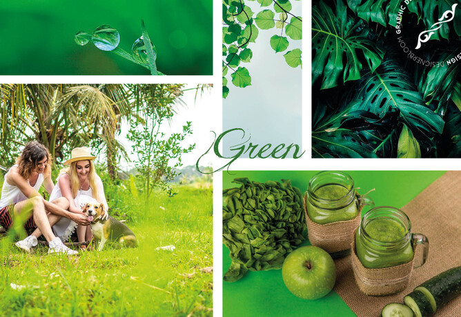
Green
Green is a colour of balance and harmony. It lends us a clearer sense of right from wrong since green incorporates a balance of both the logical and emotional. Green is one of the most-seen colours in nature reflecting life, rest, and peace. It is also a sign of growth, whether that's in a physical object like plants or in our income and wealth. Overall, if you're looking to portray health, rest, and to relieve stress, green is your colour. While green does have minor negative aspects like over-possession and materialism, it has a more positive affect than most other colours.
Green is commonly seen: Nature, economic exchange, health-based stores, and restaurants.
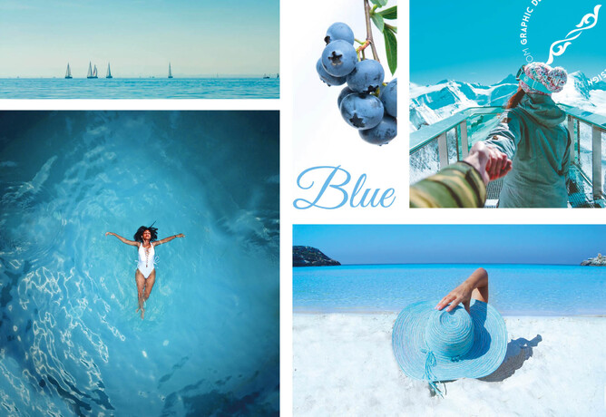
Blue
Blue is known for its trust and dependability. It's reliable, responsible, and mentally soothing. For that reason alone, it's one of the most-liked colours across the entire world. Unlike red, blue lends a more mental reaction rather than physical that allows us to destress, calm down, and think of the most ideal situation. Unfortunately, it also is one of the last colours to be seen, and can be perceived as distant, cold, or unfriendly if used it great amounts. Overall, blue is a well-liked colour that can bring a sense of calmness and trust when building relationships, especially in marketing.
Blue is commonly seen: Workout facilities, hospitals, and spas.
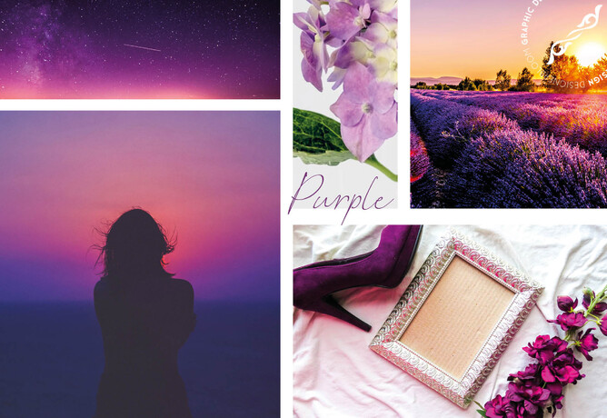
Purple
Purple is most commonly known for its imagination and spirituality. It possesses the energy and power of red, with the stability and reliability of blue, making it a perfect balance between the physical and spiritual. Purple is often used to show luxury, loyalty, courage, mystery, and magic. It's a very intriguing colour as it soothes, but also presents space for mystery and new ideas. This is why creativity is most often associated with the colour purple. When using purple, avoid using it too often as it can also cause too much introspection or distraction as thoughts begin to wonder.
Purple is commonly seen: Magic shows, fairy tales, and luxury products.
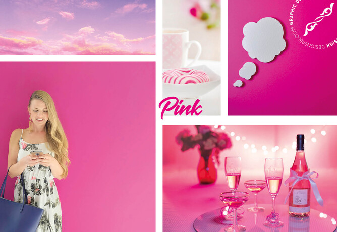
Pink
Pink is a softer, less intense version of red that creates a sense of compassion and unconditional love. While it's a very physical colour, it soothes rather than stimulates, making it a perfect colour for caring, understanding, and nurturing those in need. Pink is a sign of hope. It is also known to be very romantic as it shows empathy and sensitivity. If too much pink is used, it can be very draining, show a lack of power, and even immature. Overall, pink can be a great counter-option to the colour red when used appropriately.
Pink is commonly seen: Cancer patients, little kid objects, and bathroom products.

Brown
Brown, while maybe not the most visual stimulating colour, is a great sign of structure, security, and protection. Whether it's family, friends, and material possessions, brown offers constant support. It's also a very serious, down to earth colour you can use where black might be too intense. The downfall to brown is that it's the most safe colour and can seem reserved, scheduled, and boring. Overall, use it when necessary, but don't depend on it too heavily.
Brown is commonly seen: Campgrounds, home furnishings, and coffee shops.
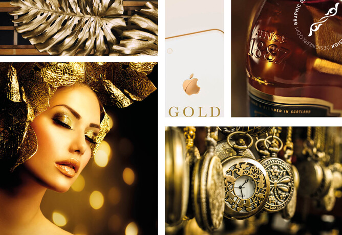
Gold
Gold has quite a few different meanings depending on your culture. Across the world, though, gold consistently represents some variation of charm, confidence, luxury, and treasure. It also can have an element of friendliness, abundance, and prosperity that is naturally attractive. Too much gold, however, can seem egotistical, proud, and self-righteous. Similar to colours like brown and black, try to use gold more sparingly to highlight rather than be the main attraction.
Gold is commonly seen: Luxury products, rings, and trophies.
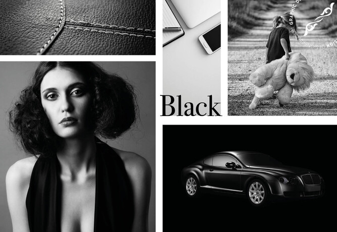
Black
Black is a colour of sophistication, seriousness, control, and independence. Although, it can also be used to show evil, mystery, depression, and even death. Black is a very reserved colour that completely lacks any light as its an absence of all the colours. It likes to stay hidden, in control, and separate from others. For this reason, black is a great colour for high contrast and easy legibility. Unfortunately, since it's a very powerful colour, too much black can cause sadness and overall negativity so use it sparingly and in your text more so than the visuals itself.
Black is commonly seen: Professional attire, luxury products, and limos.
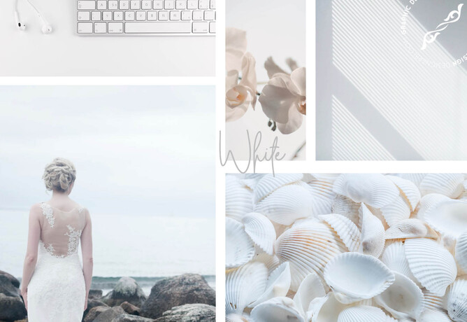
White
White is colour that is complete and pure, making it a perfect example of purity, innocence, cleanliness, and peace. White can also represent new beginnings, providing a blank slate, and gives refreshment for new ideas. Since white has an equal balance of all the colours, it can exemplify several meanings, with equality outweighing them all. White is a great colour for simplicity, cleanliness, and idea creation; however, avoid using too much white as it can cause isolation, loneliness, and emptiness.
White is commonly seen: Weddings, website backgrounds, and doctor's waiting rooms.

Handy tips
Paying attention to the mental effects of each hue can give your branding that extra something. A handy tip is to find distinct colours from your brand’s product or history and sample tones right from there. Do you have a common palette in your imagery? Try to build a palette that works around that.
Find a photo that you love or that you feel represents the tone and essence of your brand and sample directly from it to create a quick and easy palette.
At the end of the day, look at your own brand objectively and figure out what works best for your tone, objectives, audience and (ultimately) your brand.
While colour psychology has been studied and analysed over time, the psychological impact of colour is still moderately subjective.

- - - -
The information within this blog article was researched and sourced via CoSchedule.